
Cubed. Think outside the blocks. An isometric logo family featuring a simple cube with added character. Corners are rounded to soften the image while the right face of the cube is highlighted, looking to the future and signifying positivie outlook, growth, and progress. The chosen pallet implies inspiration and innovation (bright and sunny yellow, facing forward), growth and fresh ideas (young spring green, facing upward), and a trustworthy, appealing, vaguely unique foundation (calm, cool, collected teal blue, facing left).
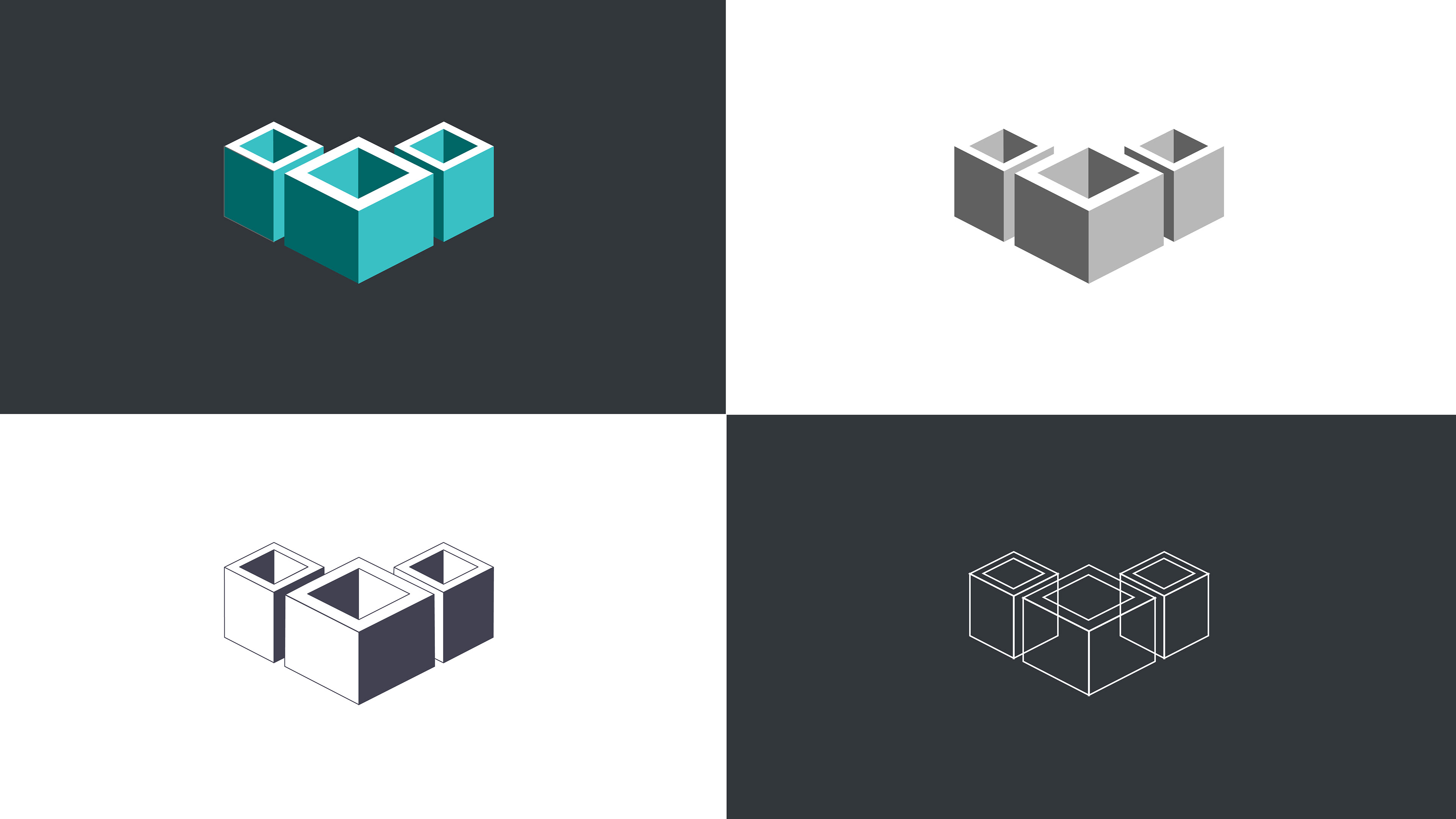
Fortitude. A foundation you can count on. An isometric logo family featuring a three open cubes, carefully arranged. Corners are clean and sharp, and the upward face is highlighed to create the apperance of a symbol embedded within. The chosen shapes convey an air of stability and permanence while the arrangement of a central parent object with two "children" give the impression of prominence, multi-faceted growth. The chosen pallet implies clarity, wellness, inspiration, and experience with a monochromatic range of two teal tones topped with bright white.
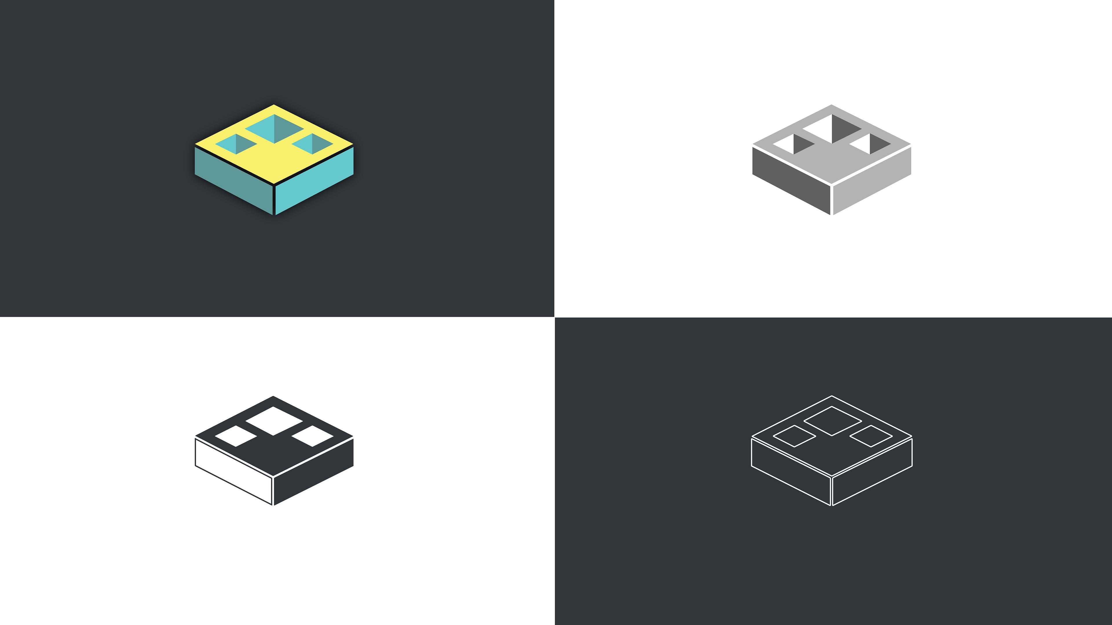
Cornerstone: Building from the ground up. Isometric logo family featuring a nearly flattened cube with strategically arranged cutouts. Built with clean lines that display a determined directionality, this simple logo carries an air of upward movement, representing progress, positivity, and growth potential. The cutouts on the surface form an upward facing triangle, signifying growth, while the wide base gives this symbol the impression of a solid, steady foundation. The chevron shape created by the two-toned sides also gives a subtle nod to classic military decoration, implying a foundation of honor, duty, and strength of character. The chosen pallet is playful yet muted, softening the image, and happily conveys a sense of youthful inspiration, ingenuity, and innovation (bright and sunny yellow, facing forward), supported by a subdued, tonal harmony featuring the brighter tone on the right face, adding a sense of time, age, and therefore maturity (two tones of turquoise).

Brevity: Stripes well earned. Isometric logo family featuring a rocky mountain peak atop a modified isometric cube. As with any classic mountain symbol, the central pinnacle signifies success, achievement, and peak performance. The solidarity of the rock itself delivers a sense of permanence, stability, and denotes a dependable nature. The two stacked chevrons appear front and center, prominently referencing classic military decoration, again implying a foundation of honor, duty, and strenth of character. Since the solid cube foundation has been split, its burden is lifted, lightening the weight of the overall logo and ushering the eye upward, where the peak appears to be rising to the sky. The chosen pallet here is a classic, bold red/blue balance with a vintage twist, and the washed out yellow together with the deep blue shadow emphasize the waning light of a "long sun," a nod to the passage of time that brings an air of wisdom and maturity to the logo.